01Why this project first
It's the one project where every decision was ours to make and every number can be checked by anyone. If we couldn't do it for ourselves, we'd have no business doing it for you.
02What the audit found
We audited ourselves first.
-
01
The phone menu was broken
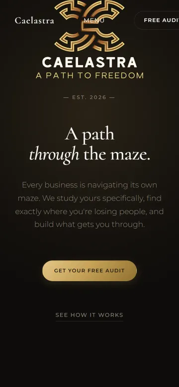
On a phone, the menu button showed as the word “MENU” printed over the logo, the logo sat underneath the menu bar, and the “Free Audit” button ran off the edge — making the whole page wider than the screen, so it slid sideways.
-
02
Main content took over four seconds to appear on mobile
Every page carried its own copy of the fonts and logo — about 440KB of code before anything was visible.
-
03
The contact form could fail silently
It relied on the visitor's email app opening, and rejected a website address typed without “https://”.
-
04
A placeholder was on show
The evidence section said “Real client results will live here” — the opposite of what an audit-led studio should show.
03The decisions
Every choice, and why.
This is the part of a project most studios never show you. For us, it is the project.
-
01
A maze drawn in code, not a stock image
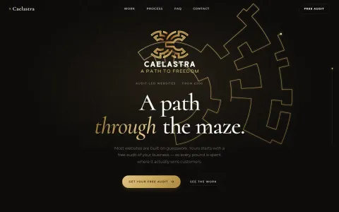
The logo is a maze, and the brand is “A Path to Freedom”. So the homepage draws a real, solvable maze in code, with the one true route tracing itself out from the centre. On a computer, the walls light up around your cursor like a lantern.
-
02
Gold used as light, not paint
A warm, desaturated gold gradient, used sparingly — on the route, the key word, the action you should take. Flat yellow reads cheap; light reads considered.
-
03
Designed twice: once for thumbs, once for cursors
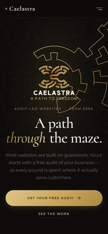
The phone version isn't a squeezed desktop. It has its own full-screen menu, a call to action that waits within thumb reach, and the enquiry form comes before the small print.
-
04
Fonts hosted by us
No requests to Google or anyone else. Pages load faster, and your visitors' browsing isn't shared with third parties. It's a detail nobody sees — and exactly the kind we don't skip.
-
05
Numbers you can check
Instead of claiming the site is fast, it measures itself live in your browser and shows you the result, below.
-
06
Enquiries that land properly
The form stays on the page, checks your details kindly as you type, and delivers a neatly formatted enquiry straight to our inbox.
04The results
Measured, not claimed.
Google Lighthouse, mobile test. “Before” is the previous live site; “after” is this build. Lower is better for time and weight.
Case 02
Your business could be next.
It starts the same way this one did: with a free, honest audit.
Request your free audit